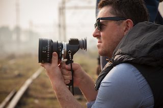
 Greig Fraser, ACS, ASC, is an award-winning Australian cinematographer. His artistic composition together with his flowing, immersive approach to cinematography has made him a go-to director of photography for a number of high-profile directors. His most well-known work includes Zero Dark Thirty (2012), Lion (2016), Rogue One (2016), Vice (2018), Dune (2021), and The Batman (2022). Fraser also returned to the Star Wars franchise with the 2019 television series The Mandalorian. Recently, Fraser shot Dune: Part Two, which will be in theatres in November. He has since joined the jury for the 2023 FilmLight Color Awards. Fraser spoke via email with Digital Cinema Report about his relationship with color and his collaboration with 2022 FilmLiight Color Awards nominee Dave Cole, for their work on the grade of Dune.
Digital Cinema Report: You have described your relationship with color as being much “deeper and more interesting than it has ever been,” and you say that you’ve been greatly influenced by your wife. What do you mean by that?
Greig Fraser: My wife is in the textile business, and she has taught me a lot on the nuances and subtleties of color ,which I’ve been able to bring into my work. Since starting to shoot on digital, I’ve found that color is particularly important because we now have the opportunity to create really subtle nuanced color that we may not have been able to find in the past with old techniques.
DCR: I understand that you often find inspiration from paintings and art works. Can you elaborate on that?
GF: I get inspiration from artists’ work in the flesh, in a gallery. I’m very much a supporter and a strong advocate of depth of color. Our eyes can see millions upon millions of colors, and I love it when a subject or a film presents that amplitude. It’s like a color depth or thickness. And this doesn’t necessarily mean saturation. Saturation can sometimes be used in the same way that chefs use sugar or salt – to create a burst of emotion. The subtleties of color are like the subtleties of fine food prepared by the right chef.”
 DCR: You’ve also said that you believe that an audience uses color as part of the menu when viewing a film and that it helps them to build the story. How does that work?
GF: Audiences are susceptible to ideas. I don’t think an audience walks into a film and judges it purely on the color. I think they use it as part of an entire dish, so to speak – to help build the world. If you have the wrong color, but everything else is right, it’s jarring for the audience.
If you don’t have a colorist that is in tune with the filmmakers and in tune with the story, you could end up with something that’s very incongruous to the final picture. And unfortunately, those films do exist, where the film is not related directly into the film itself. It becomes an outlier. And I feel like this means you lose the overall success of the visuals.
DCR: You seem to be careful to approach each individual project or film completely uniquely – making use of techniques from previous experience, but always bringing an individuality to each of his projects.
GF: I may take on techniques that I’ve learned from previous films. Whether shot on film or digital, or a combination of the two, I’ll aim to give each film its own distinct feel. And a big part of this is through color. Obviously, it’s also through lensing, camera placements, camera movement and lighting, but ultimately, all films have their own color palette. So, it’s very much the icing on the cake.
 DCR: Your relationship with a colorist seems special to you.
GF: It comes back to the subtleties again. Anybody can apply a grade to a movie. Anybody can apply a look to a movie. Anybody can light a movie. But it’s the fine-tuned subtleties that make all the difference, in my opinion. For the subtlety to exist, I must know what the film will look like before we start. This requires testing, backwards and forewords with the director and the colorist, and very careful supervision from the colorist.
DCR: How do you view the colorists’ role?
GF: My relationship with the colorist begins from the second I start talking to the director, when I start shooting tests to work out exactly how the film needs to feel. And there’s always a stressful time at the beginning of a pre-production where the film doesn’t look the way you want it to, it’s not quite there, or you need to make some changes. This is when you need to have a very good visual partner and colorist, who is able to contribute more than just making the color at the end.
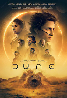
DCR: Dave Cole was a nominee in the 2022 FilmLight Color Awards for director Denis Villeneuve’s
 Film Dune and you won your first Academy Award for Best Cinematography as well as the ASC Award for Outstanding Achievement in Cinematography in Theatrical Releases, and the BAFTA Award for Best Cinematography. How did the color for the film come about?
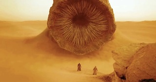
GF: We worked very hard on getting the color palette right for this film. We could not find a film set in the desert that we liked and that was appropriate for this movie. I ended up finding some stills online with references for the color. For example, the sky was more white than blue, and the sand was a lighter, but not a sandy yellow, color – more a light brown with tones blended.
DCR: I understand that you and Cole worked together through the process of building a look up table that would work, utilizing a skipped bleach process to find the colors they were looking for.
GF: We skipped bleach in the highlights to allow the sky and the whites to blow out and then used a digital LUT to allow more depth into the shadows. This is a perfect example of utilizing old techniques to create a LUT that was able to help us visualize the movie. Dune was a very multi-layered process. It wasn’t about slapping a color on it and walking away. It was about building a color and constructing a world and a feel for the film.
DCR: You’ve been named a judge for the 2023 FilmLight Color Awards. What will you be looking for as a judge?
GF: We live in a space where often films can become very ‘the same’ and are based on a trend or previous ideas. In this year’s Color Award entries, I’m looking for original vision.
The 2023 FilmLight Color Awards are currently open for entries to colorists across the globe and those working on any grading platform. There are five categories – theatrical feature; television series/episodic; commercial; music video; and the Spotlight award, for colorists working under the constraints of lower budget projects. Entries close on July 31. For more information and to enter visit https://www.filmlightcolorawards.com